Work
Sketching user interface
New components implementation
Prototyping
Developer hand off
Testing
Work
Client
Status
Team
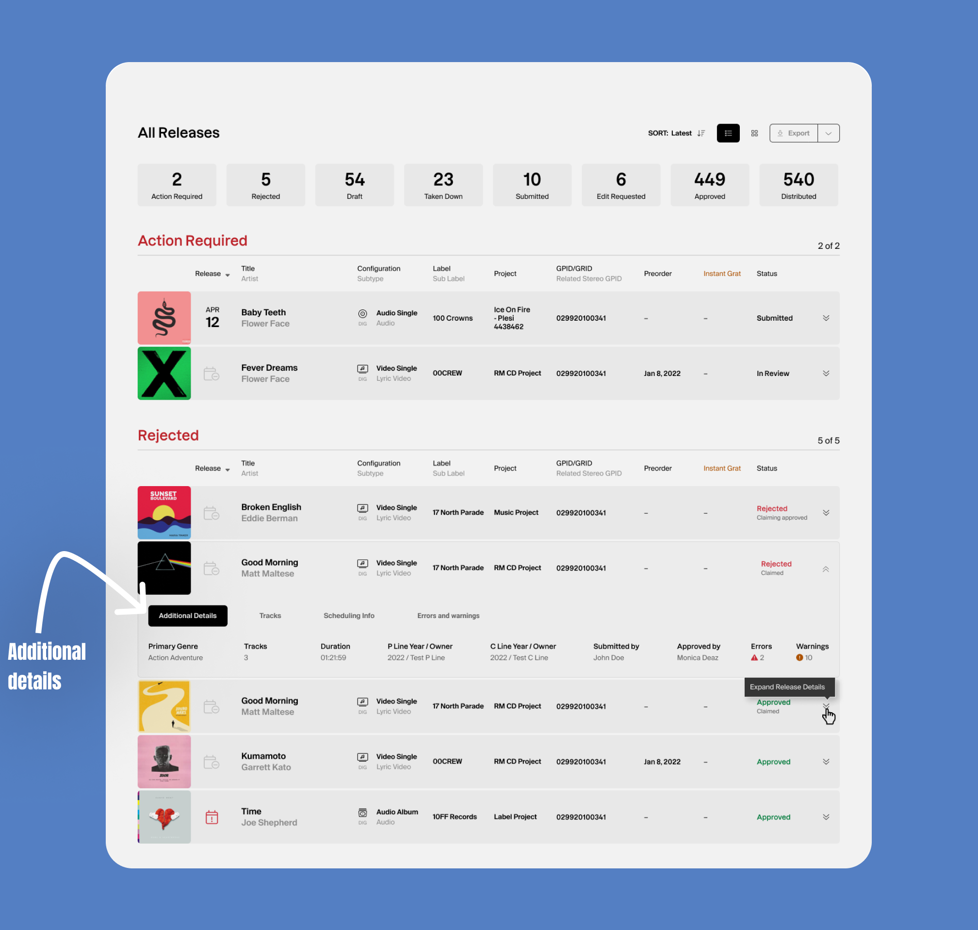
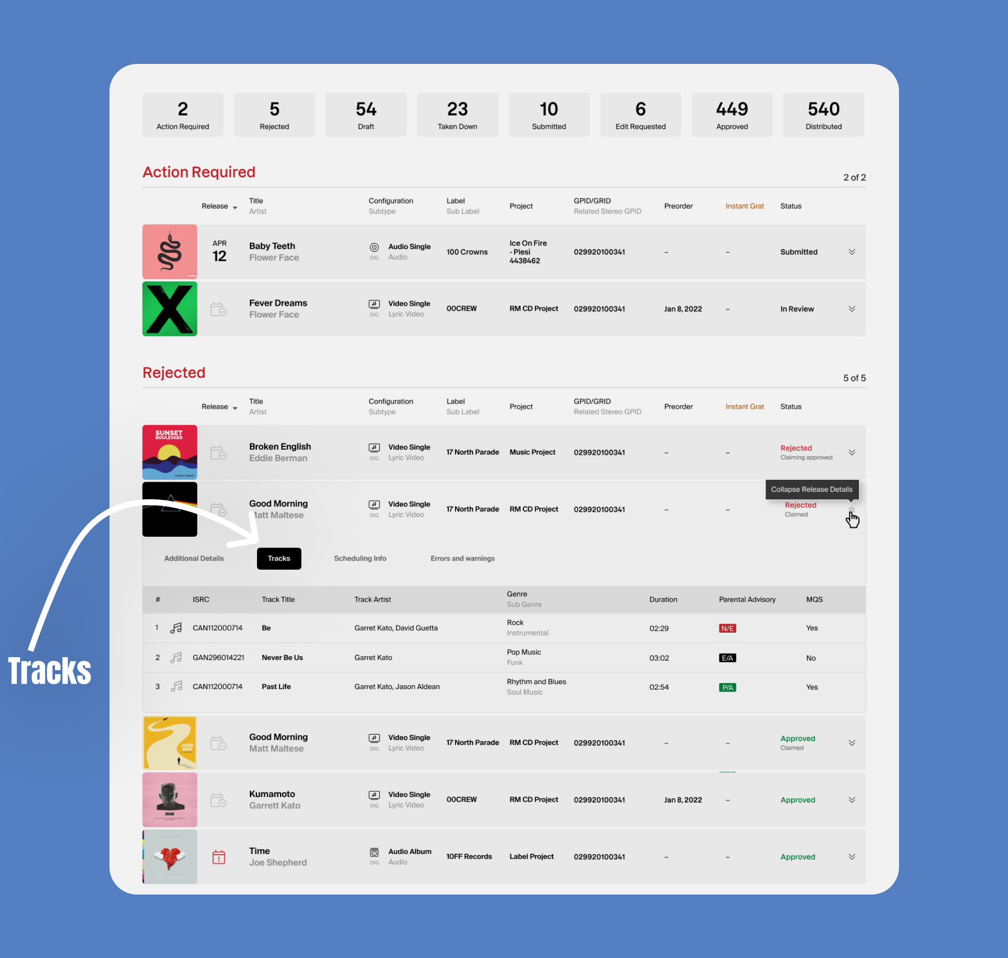
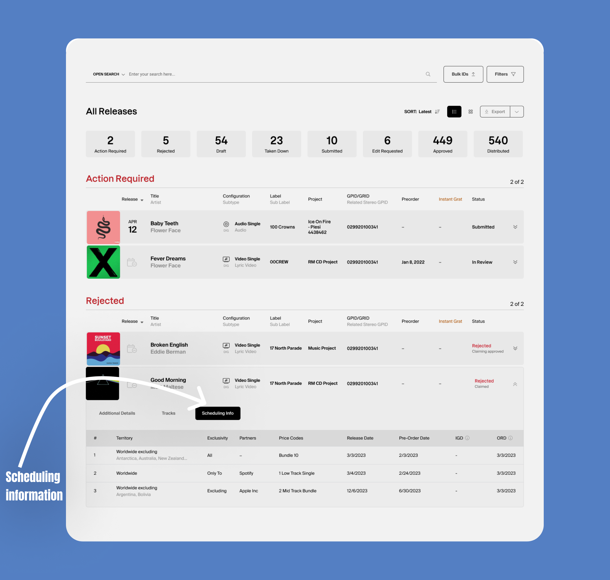
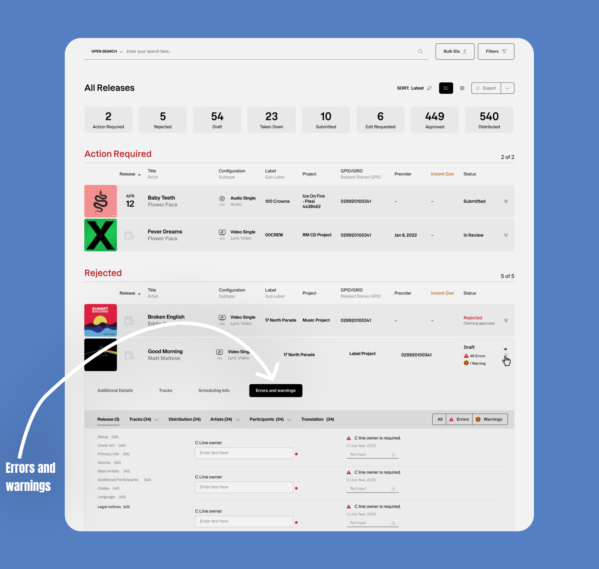
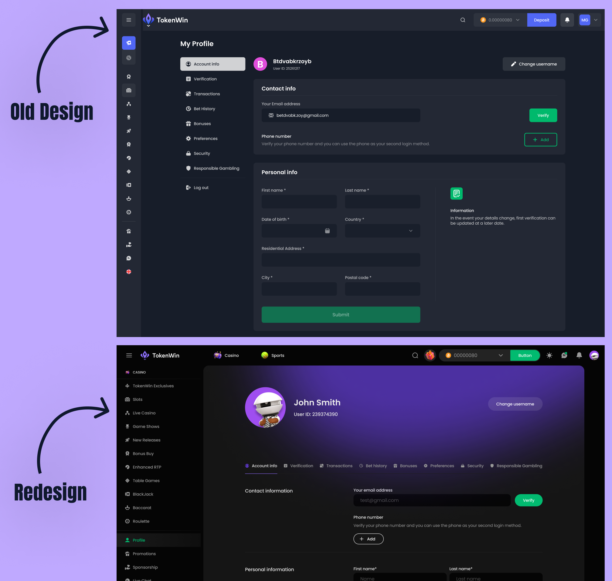
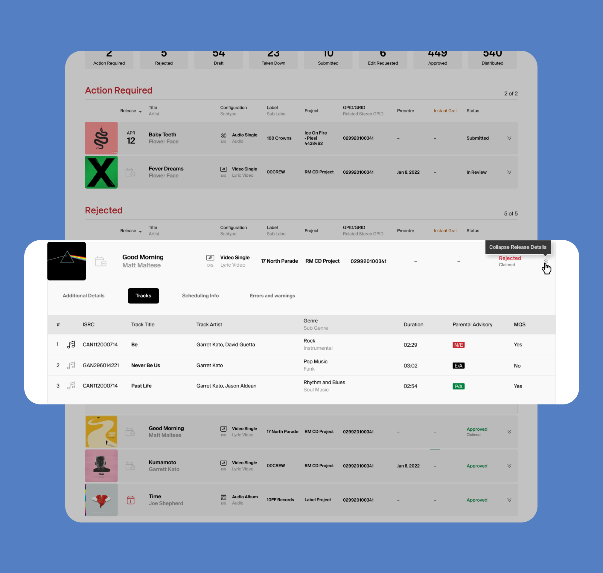
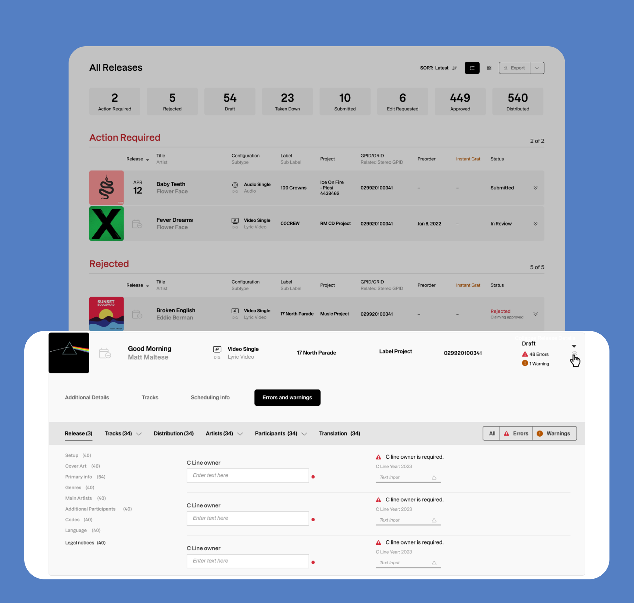
The initial issue stemmed from the need to efficiently present categorized information about releases. In the previous design iteration, this was tackled through the creation of four distinct pages, each dedicated to specific details related to releases. However, user feedback highlighted a desire for a more streamlined experience directly within the dashboard, where users could swiftly access the necessary information to perform their tasks.
To address this, a comprehensive solution was devised. Instead of maintaining separate pages, the decision was made to enhance the usability of the dashboard itself. This was achieved by expanding each release row on the dashboard and introducing tabs within these expanded rows. These tabs were meticulously designed to house different facets of release information, ensuring a more organized and accessible user interface.
One of the notable improvements was the incorporation of tabs specifically dedicated to errors and warnings. This allowed for a focused categorization of issues, enabling users to identify and resolve problems without the need to navigate away from the dashboard. The intention was to empower users with the ability to manage errors and warnings seamlessly within the context of their ongoing tasks.
By adopting this approach, the design not only addressed the challenge of presenting categorized release information but also enhanced the user experience by minimizing navigation steps and providing a more intuitive and efficient workflow. The integration of tabs within the expanded release rows ensured that users could access relevant details with ease, contributing to a more user-friendly and productive dashboard environment.